Background Information:
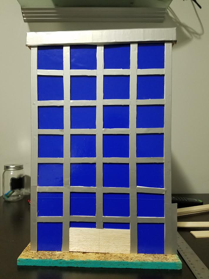
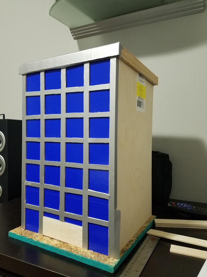
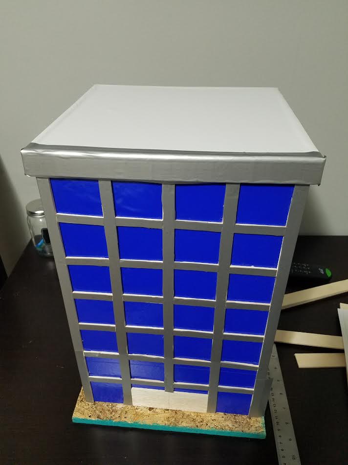
International architecture was first used in the 1920s located in Germany. It was most popular for the next ten yrs, soon after the style got picked up in the USA. Major cities like NY and LA filled the streets with these giant buildings. These building are usually 10-21 stories tall, made out of smooth materials such as; glass, steel, and concrete. The buildings have lack of decorations and have flat roofs. The style of this building uses multiple windows to cover the entire or close to the entire face of the building. The windows are either in columns or rows, with each facade angle being at 90 degrees. Other parts of the surfaces would be the steel beams between the windows to provide support. the texture of the building is always smooth and the form is usually a square or rectangle. This type of architecture is used for commercial use. Where numerous people come together within one building and accomplish individual goals.
I chose this style because of the impact it has on daily lives of many Americans. In major cities like NY or LA be enter/exit these buildings multiple times a day. It is the place were much work is done. Were innovation takes place, where the bosses of the world meet. So to me it was interesting to find more information about these building, and try to design one.
Photos:
|
|
|
Conclusion:
1) In the 1920s old traditional building material was being left behind therefore people were building with alto newer material. Such as glass, metals, concrete. That affected this architectural designing be giving it that sleek look due to the fact its made out of smooth material. Also the building could be built a lot higher now that it has more support coming from steel beams. With a growing population in the 20s, people were looking to make the most out of space, that is where the rectangular look came from. So that you can use the least amount of space to hold the most amount of people.
2) The biggest human need at the time was how to fit a huge amount of people within certain boundaries. To fix that international architecture makes it so that the building is taller than it is wider. Resulting in more building able to fit within a city but also more people can fit because the re are more floors to be on. This was made possible because the steel beams allowed for the building to be tall yet sturdy.
3) The best represented principles of design used in my model are unity, rhythm, balance, and proportion/scale. The use of windows throughout the face of the building show it to be unified. The way the lines are set up to separate the windows gives the building a balanced look, each side having the same amount of windows. Proportion and scale was used so that the door wasn't 3 times larger than a full story window. Finally rhythm was used because the windows repeat themselves in the columns and rows.
4) Other classmates had a slightly different task because they were building residential homes while mine was commercial use. However rhythm, balance, and proportion was still the same. Other classmates still had to make sure their homes had a nice rhythm throughout the whole building. Along with it being to scale so it looks realistic. Some used more balance than other depending on the style they chose. For the most part, the same principles of design were used to a certain extent.
